1.x (Vue2 compatible)
Vuejs Dialog Plugin
A lightweight, promise based alert, prompt and confirm dialog.


Vuejs Dialog Plugin
A lightweight, promise based alert, prompt and confirm dialog.
Important updates in version v1.x.x
- Dialog will always resolve with an object. (i.e callback for proceed always will receive an object)
- For directives usage, the object returned in (1) above will include a node. The node is the element the directive was bound to (see issue #5
- Styles will have to be included explicitly as they have been extracted into a separate file (see issue #28)
- If loader is enabled globally, and a dialog is triggered via a directive without a callback, the loader is ignored for clicks on proceed
- Custom class injection on parent node (see issue #25)
- Ability to register custom views. This allows for custom logic, custom buttons, etc (see issue #13, #14, #33)
- For installation via HTML script tag
- The library has been namespaced as it has been split into two. The main library which is the plugin and the mixin which is useful in custom components
- To this effect, the new way to install the plugin is slightly dufferent:
window.Vue.use(VuejsDialog.main.default) - And the mixin can be added to components like so:
mixins: [VuejsDialog.mixin.default, ...otherMixins]
Installation
HTML
// Include vuejs
<script type="text/javascript" src="./path/to/vue.min.js"></script>

// Include vuejs-dialog plugin
<link href="./path/to/vuejs-dialog.min.css" rel="stylesheet">
<script type="text/javascript" src="./path/to/vuejs-dialog.min.js"></script>
<script type="text/javascript" src="./path/to/vuejs-dialog-mixin.min.js"></script> // only needed in custom components

<script>
// Tell Vue to install the plugin.
window.Vue.use(VuejsDialog.main.default)
</script>
Package Manager
// installation via npm
npm i -S vuejs-dialog

// or

// installation via yarn
yarn add vuejs-dialog
// then
// import into project
import Vue from 'vue';
import VuejsDialog from 'vuejs-dialog';
import VuejsDialogMixin from 'vuejs-dialog/dist/vuejs-dialog-mixin.min.js'; // only needed in custom components
// include the default style
import 'vuejs-dialog/dist/vuejs-dialog.min.css';
// Tell Vue to install the plugin.
Vue.use(VuejsDialog);Webpack External
// If you're including via script tag and importing as Webpack external
// Webpack config
{
    // ... other webpack config
    externals: {
        // .. other externals if any
        'vuejs-dialog': 'VuejsDialog'
    }
}
// then
// import into project
import Vue from 'vue';
import VuejsDialog from 'vuejs-dialog';
// Tell Vue to install the plugin.
Vue.use(VuejsDialog.main.default);
// mixin available at: VuejsDialog.mixin.defaultBasic Usage inside a vuejs application
// Anywhere in your Vuejs App.

// Trigger an Alert dialog
this.$dialog.alert('Request completed!').then(function(dialog) {
  console.log('Closed');
});

// Trigger a confirmation dialog
this.$dialog
  .confirm('Please confirm to continue')
  .then(function(dialog) {
    console.log('Clicked on proceed');
  })
  .catch(function() {
    console.log('Clicked on cancel');
  });
Basic Usage outside a vuejs application
// VuejsDialog Methods are also available on the global vue
// This makes it possible to use the plugin inside a ReactJs application
// or just any javascript application
// Simply include vue, vuejs-dialog, ask vue to use the plugin and that's all:

Vue.dialog.alert('Request completed!').then(function(dialog) {
  console.log('Closed');
});

Vue.dialog
  .confirm('Please confirm to continue')
  .then(function(dialog) {
    console.log('Clicked on proceed');
  })
  .catch(function() {
    console.log('Clicked on cancel');
  });
Return value on success
// Whenever a user clicks on proceed,
// the promise returned by the dialog call will be
// resolved with a dialog object with the following shape:


{
    close: function | sometimes | A method that can be used to close the dialog if it's in a loading state
    loading: function | sometimes | A method that can be used to stop the dialog loader
    node: DOMElement | sometimes | A DOM element which the directive was bound to, when triggered via a directive
    data: any | always | Data sent with the positive action. Useful in prompts or custom components where you have multiple proceed buttons
}

// Example:

<button class="btn-danger"
        v-confirm="{
            loader: true,
            ok: okCallback,
            cancel: cancelcallback,
            message: 'Some confirmation message'}"
>

okCallback: function (dialog) {
		dialog.loading(false) // stop the loader (you won't be needing this)
		dialog.close() // stops loader and close the dialog
		dialog.node.className // === "btn-danger"
		dialog.data // === null
}
Prompt (collect data from user)
this.$dialog
  .prompt({
    title: "Let's hear from you",
    body: "What is the most important thing in life?",
  }, {
    promptHelp: 'Type in the box below and click "[+:okText]"'
  })
  .then(dialog => {
    // Triggered when proceed button is clicked
    // Show an alert with the user's input as the message
    this.$dialog.alert(dialog.data || '[empty]')
  })
  .catch(() => {
    // Triggered when dialog is dismissed by user

    console.log('Prompt dismissed');
  });
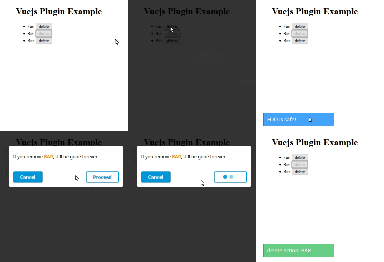
Loader enabled (asynchronous task)
this.$dialog
  .confirm("If you delete this record, it'll be gone forever.", {
    loader: true // default: false - when set to true, the proceed button shows a loader when clicked.
    // And a dialog object will be passed to the then() callback
  })
  .then(dialog => {
    // Triggered when proceed button is clicked

    // dialog.loading(false) // stops the proceed button's loader
    // dialog.loading(true) // starts the proceed button's loader again
    // dialog.close() // stops the loader and close the dialog

    // do some stuff like ajax request.
    setTimeout(() => {
      console.log('Delete action completed ');
      dialog.close();
    }, 2500);
  })
  .catch(() => {
    // Triggered when cancel button is clicked

    console.log('Delete aborted');
  });
Usage as a directive
If you don't pass a message, the global/default message would be used.
<button type="submit" v-confirm="">submit</button>// Callbacks can be provided
// Note: If "loader" is set to true, the makeAdmin callback will receive a "dialog" object
// Which is useful for closing the dialog when transaction is complete.
<button v-confirm="{ok: makeAdmin, cancel: doNothing, message: 'User will be given admin privileges. Make user an Admin?'}">Make Admin</button>methods: {
makeAdmin: function() {
// Do stuffs
},
doNothing: function() {
// Do nothing or some other stuffs
}
}A more practical use of ths v-confirm directive with multiple triggers - Solution 1
// While looping through users
<button v-for="user in users"
        v-confirm="{
            loader: true,
            ok: dialog => makeAdmin(dialog, user),
            cancel: doNothing,
            message: 'User will be given admin privileges. Make user an Admin?'}"
>
Make Admin
</button>methods: {
makeAdmin: function(dialog, user) {
// Make user admin from the backend
/* tellServerToMakeAdmin(user) */
// When completed, close the dialog
/* dialog.close() */
},
doNothing: function() {
// Do nothing or some other stuffs
}
}( new ) A more practical use of ths v-confirm directive with multiple triggers - Solution 2
// While looping through users
<button v-for="user in users"
        :data-user="user"
        v-confirm="{
            loader: true,
            ok: makeAdmin,
            cancel: doNothing,
            message: 'User will be given admin privileges. Make user an Admin?'}"
>
Make Admin
</button>methods: {
makeAdmin: function(dialog) {
let button = dialog.node // node is only available if triggered via a directive
let user = button.dataset.user
// Make user admin from the backend
/* tellServerToMakeAdmin(user) */
// When completed, close the dialog
/* dialog.close() */
},
doNothing: function() {
// Do nothing or some other stuffs
}
}For v-confirm directive, if an "OK" callback is not provided, the default event would be triggered.
// Default Behaviour when used on links
<a href="http://example.com" v-confirm="'This will take you to http://example.com. Proceed with caution'">Go to example.com</a>
Setting a dialog title
You can now set a dialog title by passing your message as an object instead of a string. The message object should contain a title and body
let message = {
  title: 'Vuejs Dialog Plugin',
  body: 'A lightweight, promise based alert, prompt and confirm dialog'
};

this.$dialog.confirm(message);
Options
// Parameters and options

let message = "Are you sure?";

let options = {
    html: false, // set to true if your message contains HTML tags. eg: "Delete <b>Foo</b> ?"
    loader: false, // set to true if you want the dailog to show a loader after click on "proceed"
    reverse: false, // switch the button positions (left to right, and vise versa)
    okText: 'Continue',
    cancelText: 'Close',
    animation: 'zoom', // Available: "zoom", "bounce", "fade"
    type: 'basic', // coming soon: 'soft', 'hard'
    verification: 'continue', // for hard confirm, user will be prompted to type this to enable the proceed button
    verificationHelp: 'Type "[+:verification]" below to confirm', // Verification help text. [+:verification] will be matched with 'options.verification' (i.e 'Type "continue" below to confirm')
    clicksCount: 3, // for soft confirm, user will be asked to click on "proceed" btn 3 times before actually proceeding
    backdropClose: false, // set to true to close the dialog when clicking outside of the dialog window, i.e. click landing on the mask
    customClass: '' // Custom class to be injected into the parent node for the current dialog instance
};

this.$dialog.confirm(message, options)
	.then(function () {
	    // This will be triggered when user clicks on proceed
	})
	.catch(function () {
	    // This will be triggered when user clicks on cancel
	});
Global Configuration
// You can also set all your defaults at the point of installation.
// This will be your global configuration

// use VuejsDialog.main.default if including via script tag
Vue.use(VuejsDialog, {
  html: true,
  loader: true,
  okText: 'Proceed',
  cancelText: 'Cancel',
  animation: 'bounce'
});

// Please note that local configurations will be considered before global configurations.
// This gives you the flexibility of overriding the global config on individual call.
CSS Override
If you have included the plugin's style and wish to make a few overides, you can do so with basic css, ex:
.dg-btn--ok {
  border-color: green;
}

.dg-btn-loader .dg-circle {
  background-color: green;
}
Useful tip for customization
You can use any of the options in your verification help text. Example:
this.$dialog.confirm($message, {
  verificationHelp: 'Enter "[+:verification]" below and click on "[+:okText]"',
  type: 'hard'
});
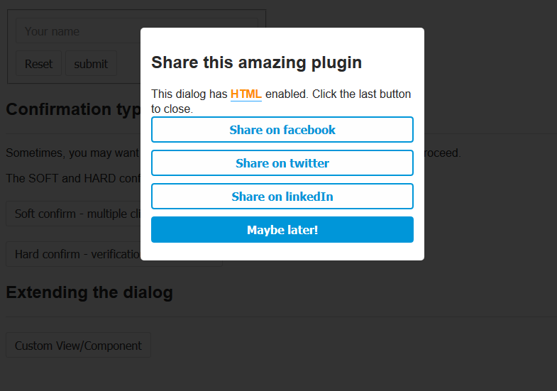
More flexibility with Custom components
/* File: custom-component.vue */
<template>
    <div class="custom-view-wrapper">
        <template v-if=messageHasTitle>
            <h2 v-if="options.html" class="dg-title" v-html="messageTitle"></h2>
            <h2 v-else class="dg-title">{{ messageTitle }}</h2>
        </template>
        <template v-else>
            <h2>Share with friends</h2>
        </template>

        <div v-if="options.html" class="dg-content" v-html="messageBody"></div>
        <div v-else class="dg-content">{{ messageBody }}</div>
        <br/>

        <ok-btn @click="handleShare('facebook')" :options="options">Facebook</ok-btn>
        <ok-btn @click="handleShare('twitter')" :options="options">Twitter</ok-btn>
        <ok-btn @click="handleShare('googleplus')" :options="options">Google+</ok-btn>
        <ok-btn @click="handleShare('linkedin')" :options="options">LinkedIn</ok-btn>
        <cancel-btn @click="handleDismiss()" :options="options">Dismiss</cancel-btn>
    </div>
</template>

<script>
import DialogMixin from 'vuejs-dialog/vuejs-dialog-mixin.min.js'; // Include mixin
import OkBtn from 'path/to/components/ok-btn.vue';
import CancelBtn from 'path/to/components/cancel-btn.vue';

export default {
  mixins: [DialogMixin],
  methods: {
    handleShare(platform) {
      this.proceed(platform); // included in DialogMixin
    },
    handleDismiss() {
      this.cancel(); // included in DialogMixin
    }
  },
  components: { CancelBtn, OkBtn }
};
</script>

<style scoped="">
button {
  width: 100%;
  margin-bottom: 10px;
  float: none;
}
</style>
import Vue from 'vue';
import CustomView from './path/to/file/custom-component.vue';
const VIEW_NAME = 'my-unique-view-name';
Vue.dialog.registerComponent(VIEW_NAME, CustomView);
let vm = new Vue({
methods: {
showCustomView() {
// Note: Use confirm instead of alert if you need to handle rejection
this.$dialog.alert(trans('messages.html'), {
view: VIEW_NAME, // can be set globally too
html: true,
animation: 'fade',
backdropClose: true
});
}
}
});... and you get your custom view


